With the Supplemental Nutrition Assistance Program in the news because of proposed cuts, we took another look at the data. The bottom line: Rural areas cluster near the top of counties that are most reliant on SNAP.
Rural counties and small metropolitan areas crowd the top of the list of U.S. counties that rely most on help from the Supplemental Assistance Nutrition Program, the USDA program formerly known as Food Stamps.
Of the top 100 counties ranked by the share of population that participates in SNAP, 85 are rural, according to 2015 Census data. And the few metropolitan counties that did make the top-100 list are predominately in smaller metro areas.
The list of counties that are most reliant on SNAP encompasses regions with well documented and chronic poverty. The top three counties are in Indian Country — South Dakota and Alaska. The next county on the list, with 48% of its population participating, is in West Virginia’s coalfields. Next is a Mississippi county in the Delta. And rounding out the top six is a county on the Cumberland Plateau of Eastern Kentucky.
Also high on the list are counties in the Black Belt South – the region named for its dark, rich soil that stretches from southern Virginia to Louisiana.
The pattern is not a surprise, since those regions have high rates of poverty and SNAP eligibility is based on income. But the lack of metropolitan areas in the top-100 list is striking. Portions of Philadelphia, Baltimore and New York City are on the list.
SNAP is in the news because of a dust up in the House of Representatives. Republicans on the Agriculture Committee have passed a farm bill that could cut as much as $9 billion from SNAP. This maneuver appears to be shattering the classic coalition of lawmakers that normally makes the farm bill a bipartisan exercise.
With this legislative issue in mind, we looked back at 2015 Census data to see what we could find.
In 2015, SNAP use was 2.5 points higher in rural counties (defined as nonmetropolitan) than metropolitan ones – 16% vs. 13.5%.
SNAP usage has declined nationwide as the economy has recovered from the Great Recession. The current national rate – based on our rough calculation – is at least a full point lower than the 2015 rate. We don’t have data in a format that allows us to break out the most recent rural and urban participation rates, but rural areas have been slower to recover from the recession than metropolitan ones. That, in turn, will likely keep the rural participation rate higher than the urban rate.
Remember that we are talking about the participation rate. In raw numbers, there are far more urban Americans participating in SNAP than rural ones (about 37.2 million metro residents vs. about 7.4 million rural residents in 2015).

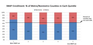
Another way to look at the data is to break the counties into “quintiles” by their rank in SNAP participation rates. This divides counties into five sets of equal numbers. The counties with the highest participation rates go in the first quintile. The next highest group goes in the second quintile, and so on.
If SNAP usage were evenly distributed among U.S. counties, each quintile would be about two-thirds nonmetropolitan counties. What we find is that rural counties cluster toward the top of the list. They are overrepresented in the top quintile (74%), the bar on the left.
To help show what an even distribution would look like, we’ve added a line that shows the percentage of U.S. counties that are rural. When the blue bar is above that line, rural counties are over-represented in that quintile, and vice versa.
This article was originally published by Daily Yonder.


